The 100ms budget
A tenth of a second is the line between “instant” and “waiting.” What to do on each side of it.
 Sidhanshu Monga··8 min read
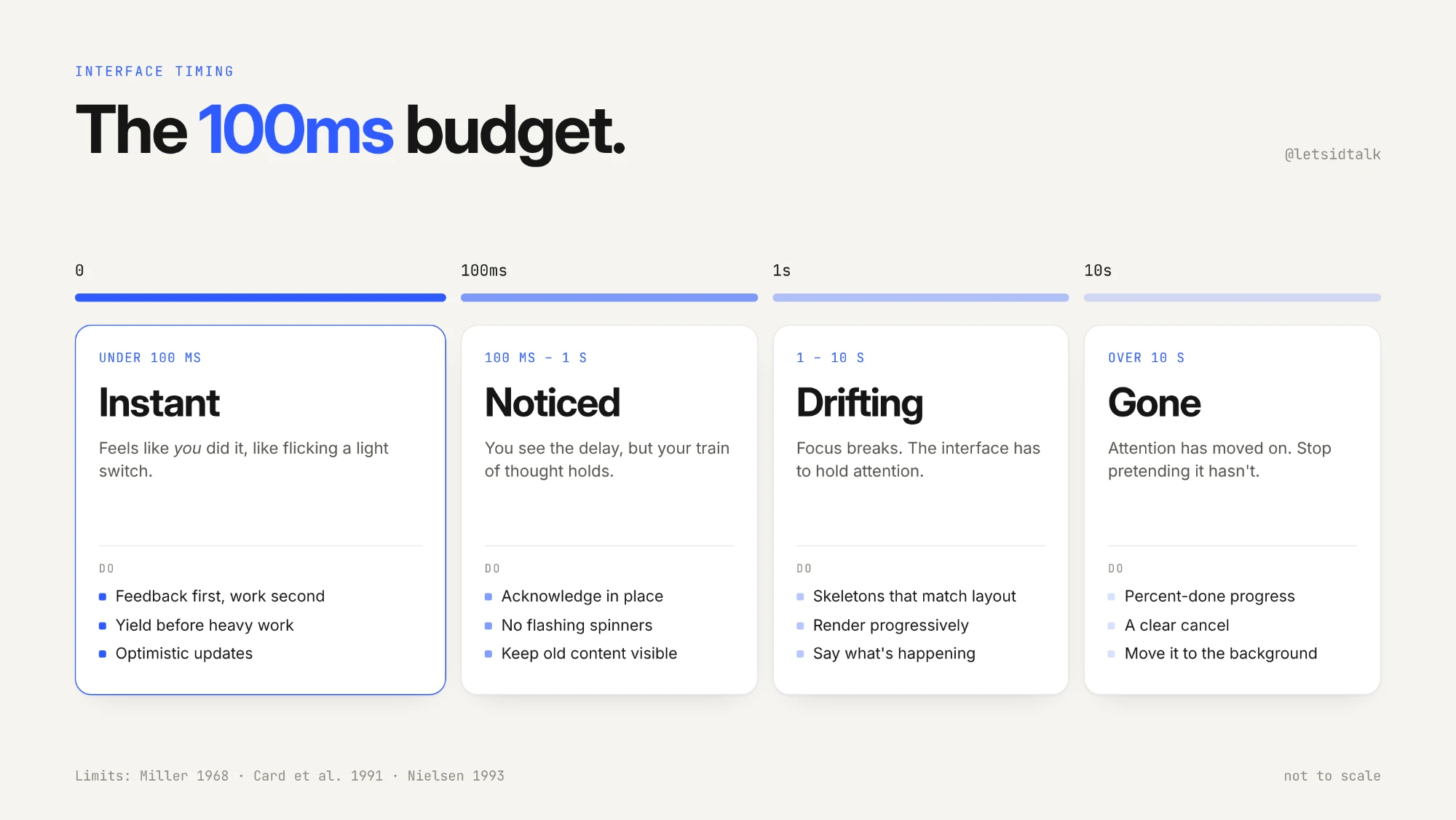
Tap a button. If something happens within about a tenth of a second, it doesn't feel like the computer responded. It feels like you did it, the way a light switch feels. Past that line, a gap opens between your action and the result. It's small at first, but you notice it, and once you notice it, you start waiting.
That line is the 100 millisecond budget. It's one of the oldest numbers in interface design, and still one of the most useful, because it tells you two things: how fast you need to respond, and what to do when you can't.
This essay is about both sides of the line.
Where the number comes from
The 100ms figure isn't a performance team's arbitrary target. It comes from research into human perception that is older than the web.
Robert Miller's 1968 paper Response time in man-computer conversational transactions and Card, Robertson and Mackinlay's 1991 work on information visualisation led to three limits, which Jakob Nielsen summarised in 1993 and which have barely changed since:
- 0.1 seconds: the limit for the user to feel the system is reacting instantaneously.
- 1 second: the limit for the user's flow of thought to stay uninterrupted, even though they notice the delay.
- 10 seconds: the limit for keeping the user's attention on the task at all.
Google's RAIL performance model put the same idea in engineering terms: responses under 100ms feel immediate, delays from 100ms to 1s still feel like a natural progression, after 1 second users lose focus, and after 10 seconds they get frustrated and are likely to abandon the task.
Same three lines, three decades apart. Human perception hasn't changed, and we've kept relearning it.
The budget is smaller than it looks
Here's the catch: you don't get to spend all 100ms on your code.
When a user clicks, the time until they see something is made of three parts. This is exactly how the browser's Interaction to Next Paint (INP) metric breaks it down:
- Input delay: the time before your event handler even starts, usually because the main thread is busy with something else.
- Processing: your event handlers running.
- Presentation delay: the browser calculating styles and layout, then painting the next frame.
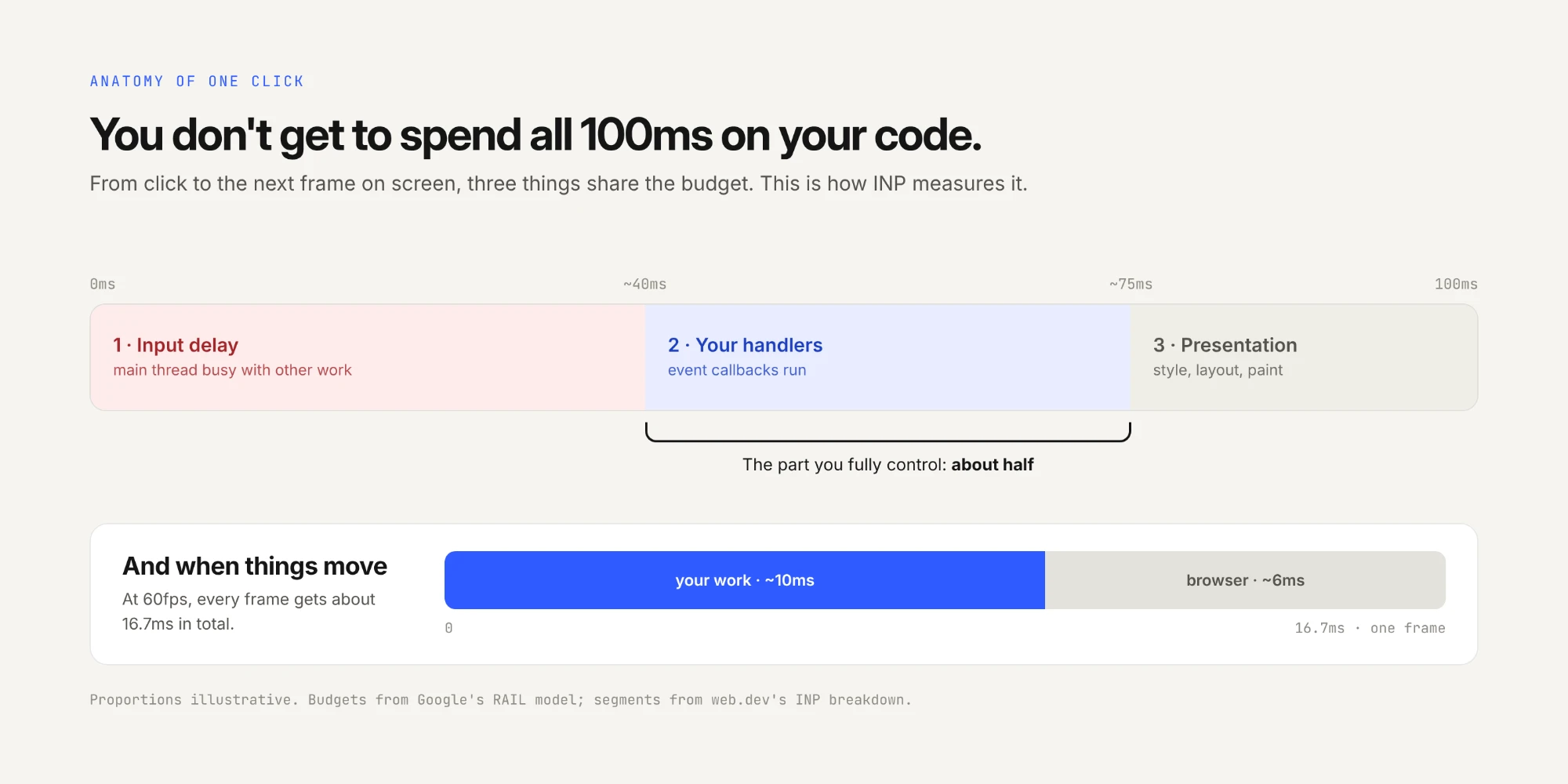
So your click handler shares the budget with whatever else happened to be running, and with the browser's own rendering work. That's why RAIL's guidance is to process input within 50ms: input can sit in a queue behind other work, so you only control about half the budget.
And if anything on screen is moving, the budget gets much smaller. At 60 frames per second, each frame has about 16ms, and the browser needs some of that for itself. RAIL suggests your own work should take about 10ms per frame.
The practical consequence is simple:
Feedback first, work second.
Under 100ms: feel instant
On this side of the line, the goal is that the interface responds before the user has time to wonder whether it will.
Acknowledge the input immediately. Pressed states, ripple effects, a checkbox ticking: these are cheap and should never wait for anything. Pure CSS like :active runs without any of your JavaScript in the way.
Move expensive work out of the way of the paint. If a click has to trigger something heavy (filtering a big list, recalculating a layout), show the feedback, let the browser paint it, then do the work.
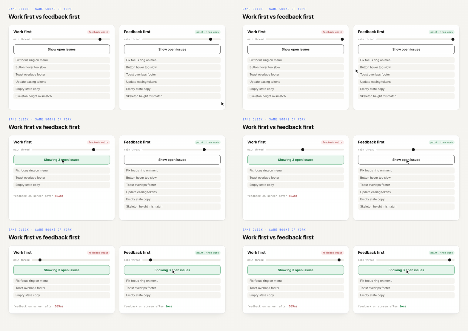
Both buttons in that recording do exactly the same work. The only difference is the order:
// Resolves after the browser has painted the next frame
const afterNextPaint = () =>
  new Promise((resolve) => requestAnimationFrame(() => setTimeout(resolve, 0)));

filterButton.addEventListener("click", async () => {
  filterButton.setAttribute("aria-pressed", "true"); // 1. feedback
  await afterNextPaint();                            // 2. let it paint
  applyFilters(bigList);                             // 3. then the work
});
Why not just await a plain setTimeout(0)? Because a timeout can fire before the browser's next frame, so the work would start before the feedback ever reaches the screen. Scheduling the timeout from inside requestAnimationFrame guarantees the frame with your feedback is painted first.
Assume success when it's safe. For actions that almost always succeed, like likes, toggles and reordering, show the result immediately and confirm with the server in the background. That's optimistic UI, and it turns a network round trip into a 0ms interaction. (There's a whole essay to write about this: Optimism as a feature is on the essay wishlist. In the meantime, the Optimistic UI breakdown shows it working.)
Break up long tasks. Any task over 50ms on the main thread is a "long task", and long tasks are the main cause of input delay. Split them into chunks and yield between them, so a click that arrives in the middle never waits more than one chunk:
function yieldToMain() {
  // scheduler.yield() keeps your place in the queue where supported
  if (globalThis.scheduler?.yield) return scheduler.yield();
  return new Promise((resolve) => setTimeout(resolve, 0));
}

async function processAll(items) {
  for (const chunk of chunks(items, 200)) {
    processChunk(chunk);
    await yieldToMain(); // let pending clicks and key presses run
  }
}
100ms to 1 second: acknowledge, don't alarm
Here the user will notice the delay, but their flow of thought stays intact. The interface's job is to show it heard them, without making a big deal of the wait.
Don't show a spinner yet. A spinner that appears for 200ms and vanishes reads as a flicker, and makes the app feel less stable than no loader at all. If you show a loader, delay it, and once it's shown, keep it up for a minimum time so it doesn't flash.
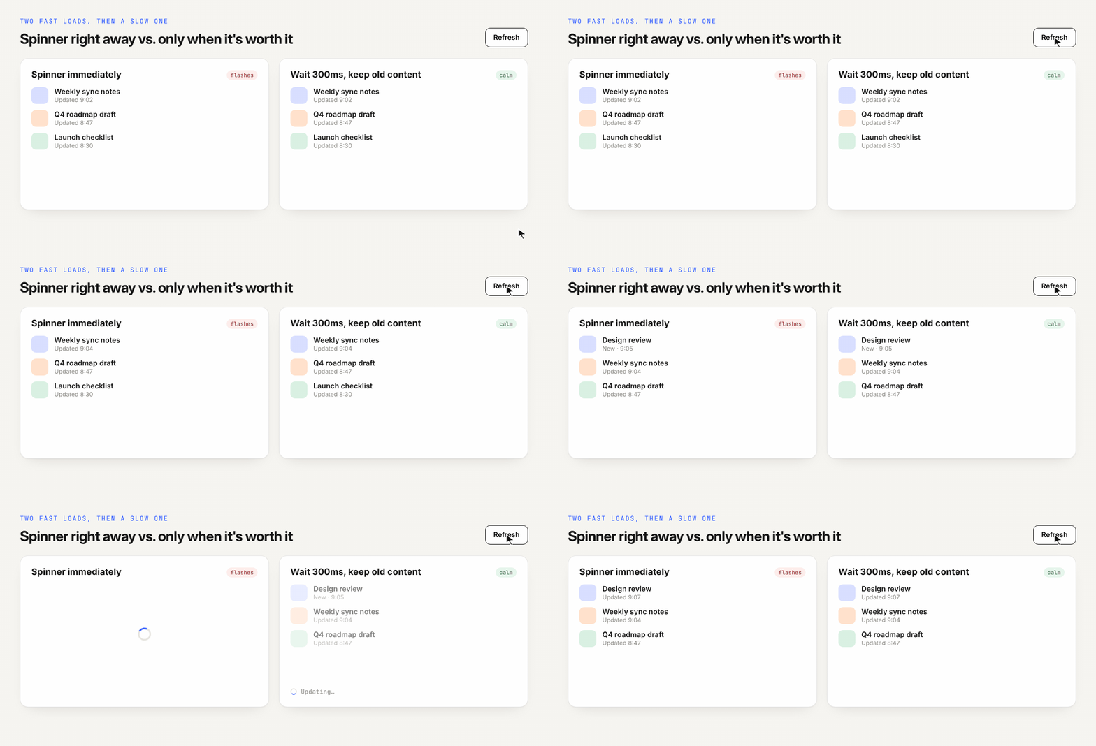
Change state in place. A button that switches to "Saving…" or dims slightly, or a row that fades into its new position, says "working on it" without taking attention away from the task.
Keep the old content until the new content is ready. Navigating to a new view and showing a blank screen for 400ms feels slower than keeping the current view for 400ms and then swapping. React's transitions (useTransition) exist largely for this reason.
1 to 10 seconds: hold their attention
Past one second, the user's train of thought breaks. Now the interface has to work harder to keep them oriented.
Show the shape of what's coming. Skeleton screens that match the real layout let users start reading the page before it arrives, and avoid a layout jump at the end.
Render progressively. Show whatever is ready: the header before the comments, the first ten results before the next hundred. Streaming server rendering and suspense boundaries are built for this.
Say what's happening if it's more than one step. "Uploading… Processing… Almost done" is far more reassuring than one spinner, because each change of message is proof of progress.
Over 10 seconds: let them go
At this point the user's attention has moved on, and pretending otherwise just frustrates them. Nielsen's guidance is direct: operations over about 10 seconds need a percent-done indicator and a clearly signposted way to interrupt.
- Show real progress, not a spinner. A determinate progress bar gives users the one thing a spinner can't: a sense of how long is left.
- Let them cancel. A long operation without a cancel button feels like a trap.
- Let them leave. Better still, move the work to the background, let the user carry on, and notify them when it's done. Exports, video processing and large uploads should rarely block the screen.
The cheat sheet
| Response time | How it feels | What the interface should do |
|---|---|---|
| Under 100ms | Instant, as if you did it | Nothing extra. Just respond. Feedback first, work second. |
| 100ms – 1s | Noticed, but flow stays intact | Acknowledge in place. No spinners. Keep old content until new content is ready. |
| 1 – 10s | Attention starts to drift | Skeletons, progressive rendering, step-by-step status. |
| Over 10s | Attention is gone | Percent-done progress, a cancel button, or move it to the background. |
Measuring it
Perception targets are only useful if you check them against real users. The Interaction to Next Paint metric, which replaced First Input Delay as a Core Web Vital in March 2024, measures exactly the click-to-paint latency described above. A page is considered good if INP is 200ms or less at the 75th percentile, and poor above 500ms.
Notice that INP's "good" threshold (200ms) is more generous than the 100ms perception line. That's not a contradiction. INP is a field threshold for the slow tail of real interactions across real devices. The 100ms line is what you design for so that the tail stays under 200.
You can watch interaction latency on your own pages with the Event Timing API:
new PerformanceObserver((list) => {
  for (const entry of list.getEntries()) {
    const inputDelay = entry.processingStart - entry.startTime;
    const processing = entry.processingEnd - entry.processingStart;
    console.log(
      `${entry.name}: ${Math.round(entry.duration)}ms total`,
      `(input delay ${Math.round(inputDelay)}ms, handlers ${Math.round(processing)}ms)`
    );
  }
}).observe({ type: "event", durationThreshold: 16, buffered: true });
When an interaction is slow, that breakdown tells you which third of the budget you overspent: a busy main thread, slow handlers, or expensive rendering.
Speed is a feeling
The 100ms budget is usually framed as a performance number, but it's really a statement about people. Under it, the interface feels like an extension of the user's hand. Over it, it feels like a separate thing they're waiting for.
Most interfaces can't be fast at everything. Good ones are honest about which side of the line each interaction is on, and design for that side on purpose.
Sources
- Jakob Nielsen, Response Times: The 3 Important Limits (Nielsen Norman Group; originally from Usability Engineering, 1993), citing Miller (1968) and Card, Robertson & Mackinlay (1991).
- web.dev, Measure performance with the RAIL model.
- web.dev, Interaction to Next Paint (INP).
- Chrome for Developers, Use scheduler.yield() to break up long tasks.
I also post short videos about UX engineering on Instagram at @letsidtalk.
